Styling
Exploring the Aperture Series: At Home with Co-Founder Michelle Halford
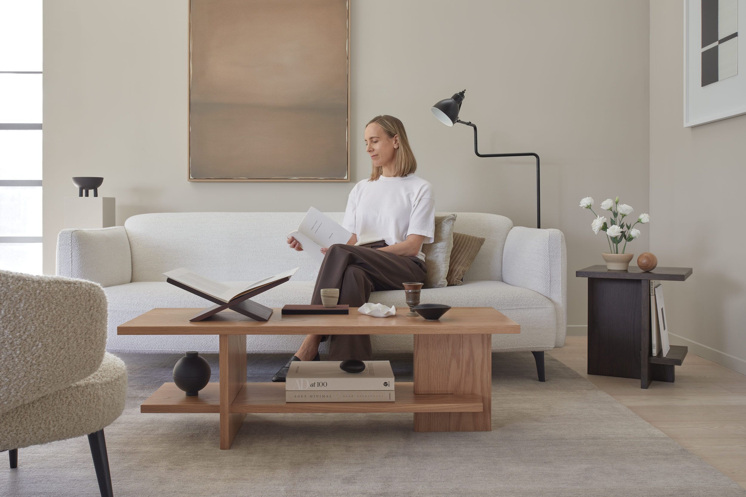
For Vertone's first journal story, Michelle Halford, co-founder of the brand, offers a glimpse into her personal space where she has styled the Aperture series. Sharing insights into the design process and her fondness for the collection, she also provides styling tips for both the low and side tables.
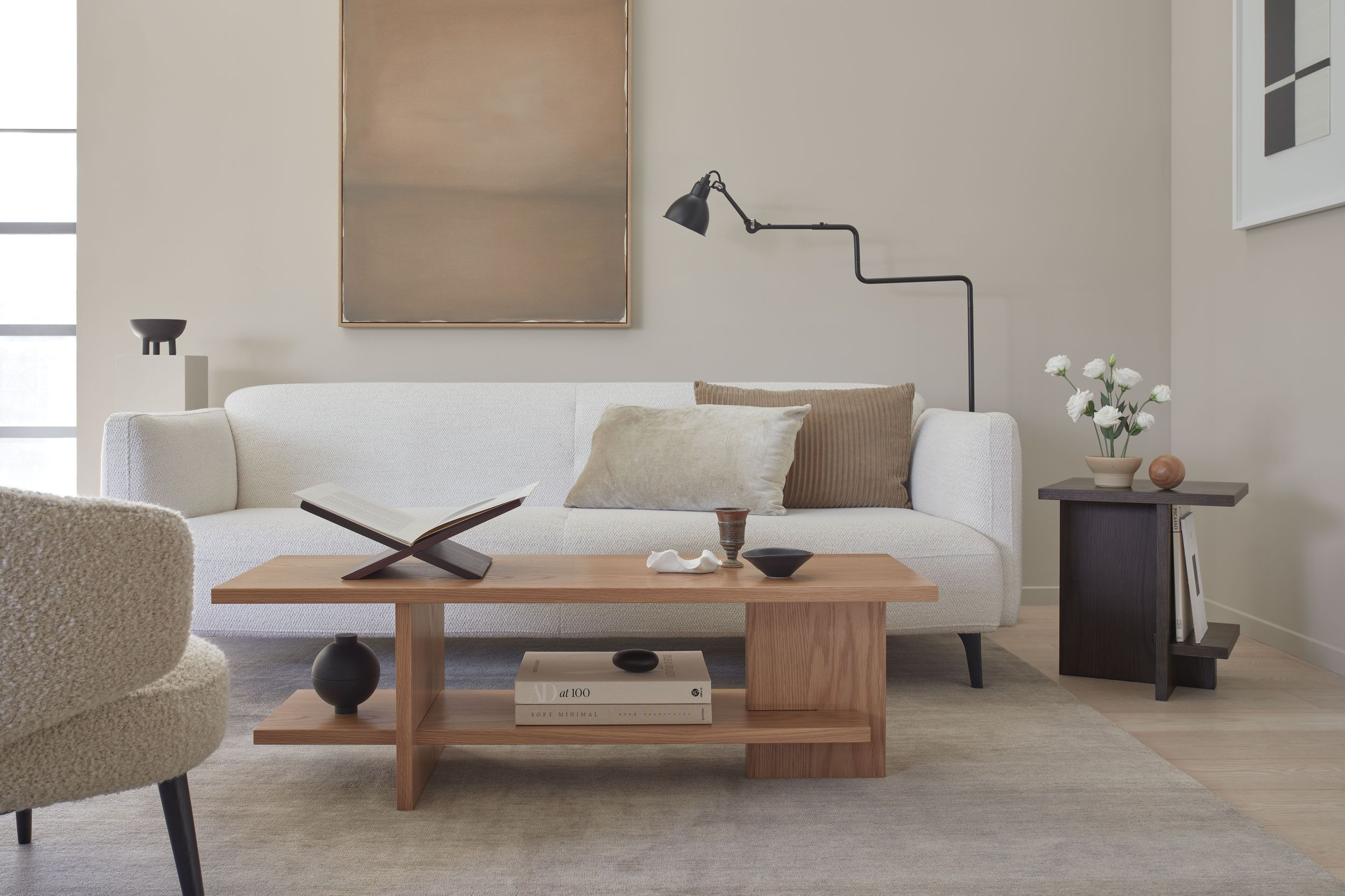
Aperture Low Table:
Designed with versatility in mind, the low table seamlessly integrates into various areas of the home, from the living room to the bedroom. Michelle recounts experimenting with different placements—as a coffee table, against the wall and at the end of the bed.
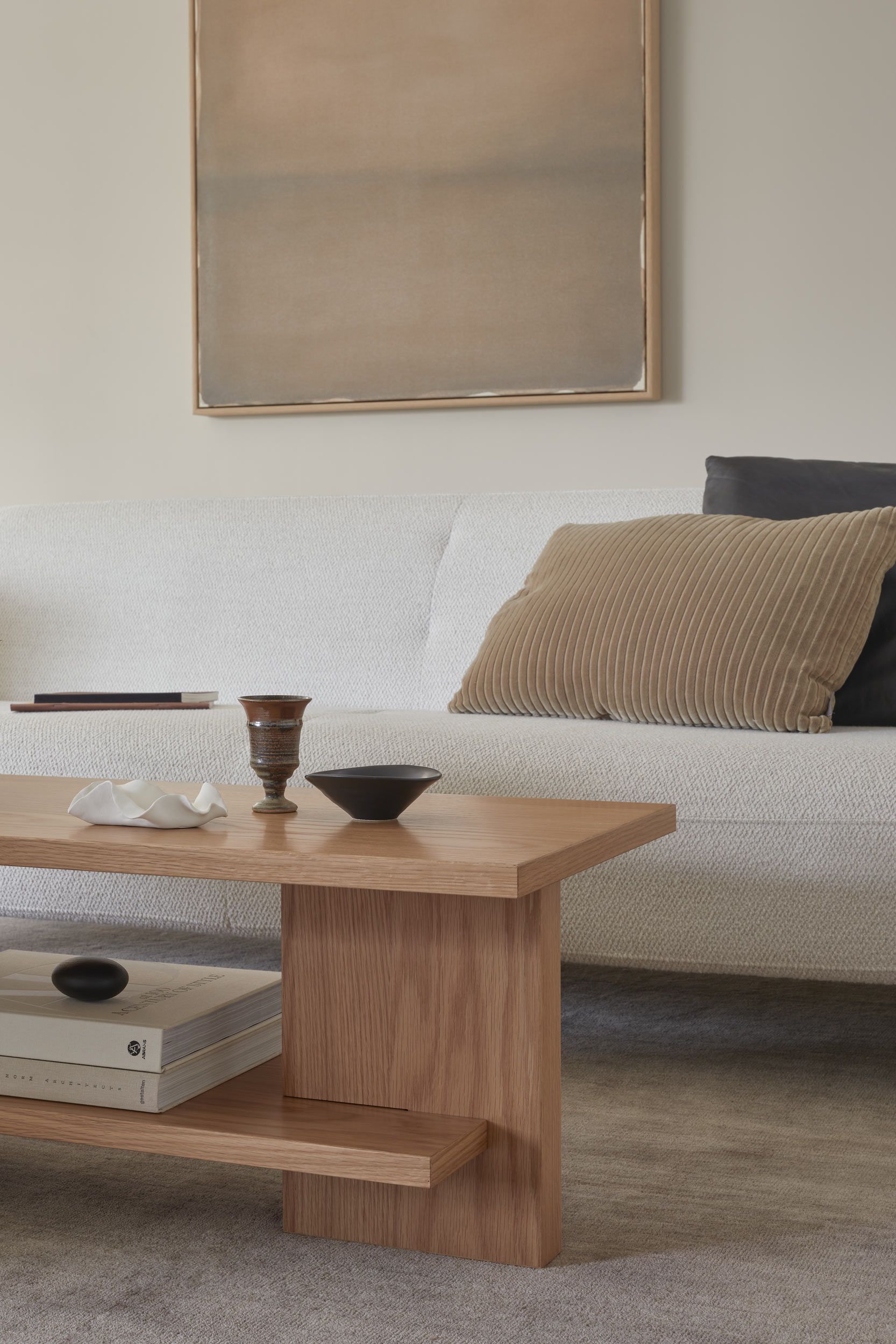
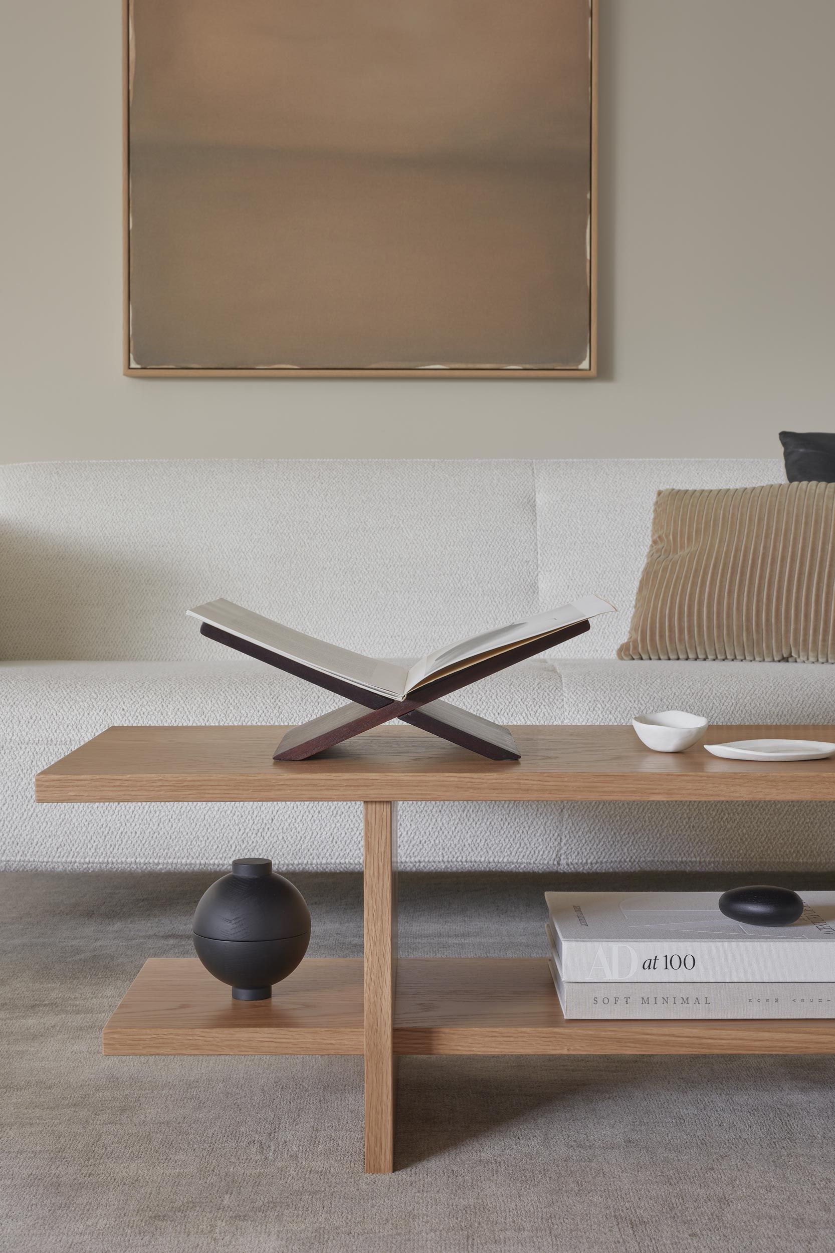
“During the prototype phase I would move the table around our living space and get a feel for how it looked and functioned in different areas. I love how the structural solidity of the design grounds the space, yet still feels light, and that the ample surface area invites creative displays of books and objects, adding layers of visual interest.”
Aperture Side Table:
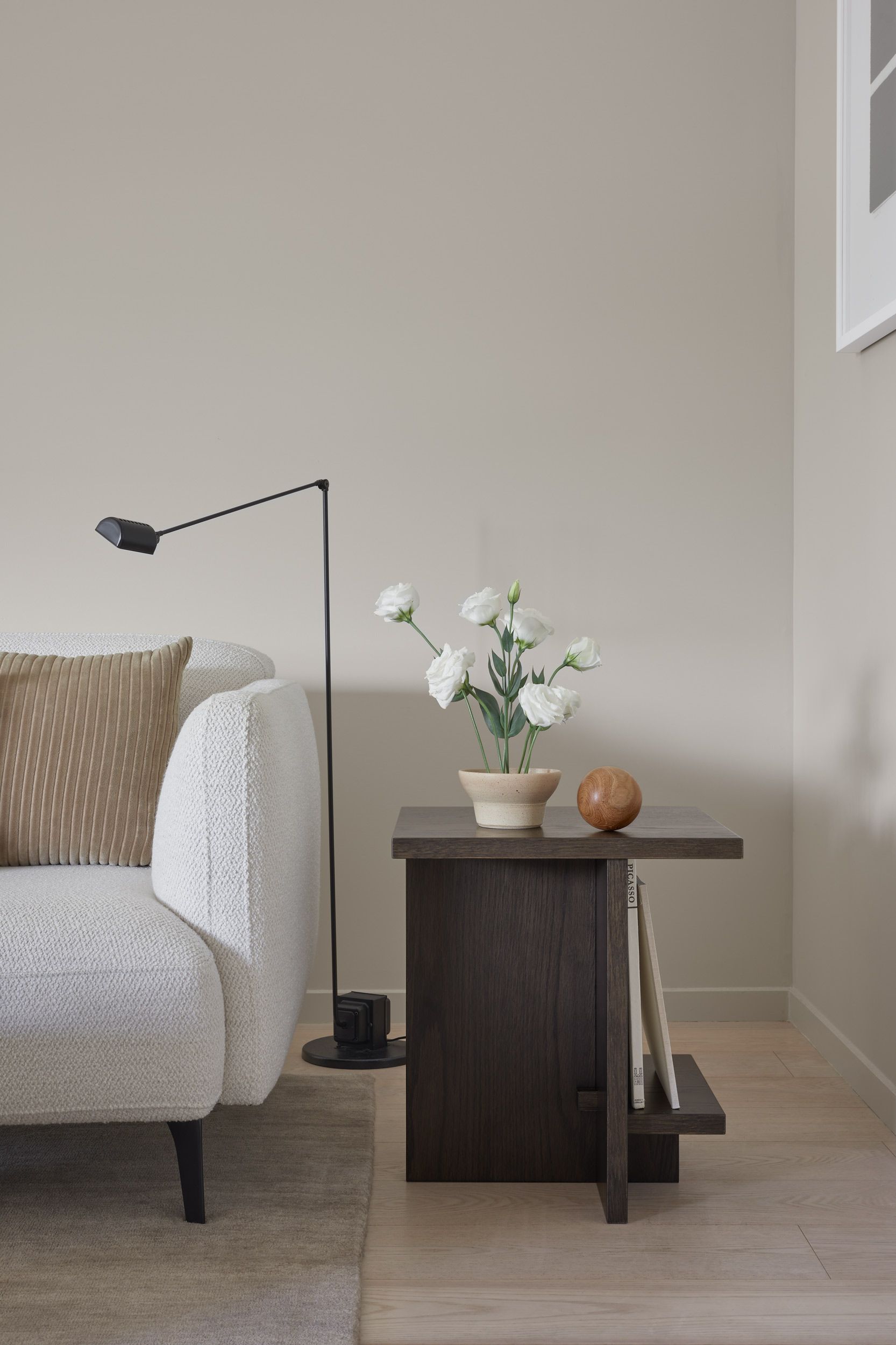
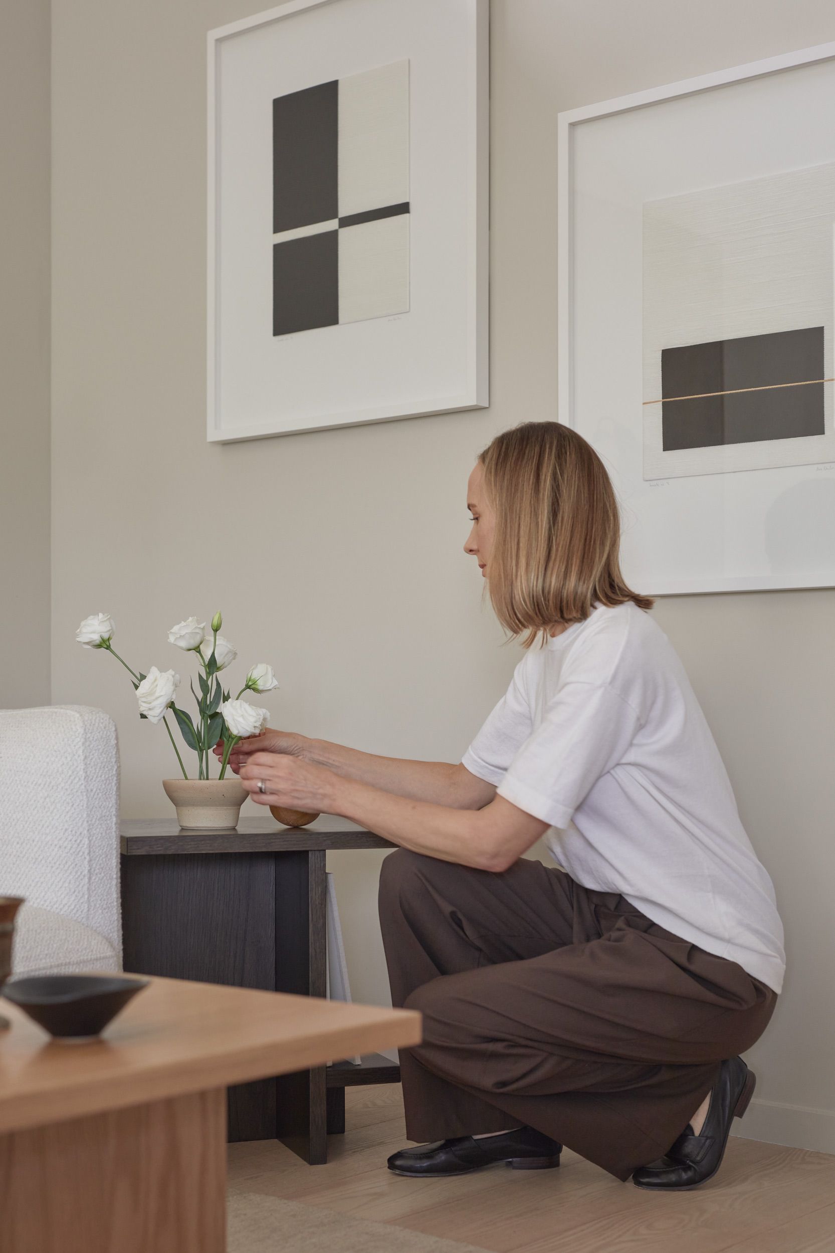
Creating a smaller version of the low table that was equally elegant and functional took a long time to get right. As Michelle explains, “we wanted the table to share the same play on proportions, balance and scale, and we worked through many iterations before landing on the final design. One of my favourite elements is the shelf which features small wooden blocks on the opposing side inspired by Japanese woodworking. The Side table looks beautiful from every angle and can easily transition from the living room to the bedside.”
Styling Tips:
Books:
Michelle's love for books and the lived-in feel they bring to a home is reflected in the designs. Both tables provide space to curate books, where you can showcase favourite covers and play with different stacked volumes for visual intrigue.
Focal Point:
Use strategically placed focal points, such as Michelle has done with a book holder and Ikebana arrangement, to capture the eye and add volume to the curation.
Variation and Contrast:
Create interest by experimenting with objects of differing heights and a mix of textures and patterns. To maintain cohesion, Michelle carries similar neutral tones throughout the styling, with the addition of black and dark brown accents for contrast.
Groupings:
How you group and space objects will add to the overall sense of harmony. Place smaller objects to the side and in front of taller objects to create depth (groupings of three objects in this way is always visually pleasing) and leave space between objects to avoid overcrowding.
Rounded Forms:
Softening the clean lines of the tables, sculptural pieces with rounded edges infuse a sense of warmth and elegance.
Mix it Up:
The tables are designed to showcase the things you love. Michelle has styled a mix of cherished objects—Danish and Japanese design pieces, vintage finds and handmade objects— each contributing to the unique character of the space.
